Client
Ministry of Education Malaysia (MOE)
Location
Putrajaya, Malaysia
Project Year
2019

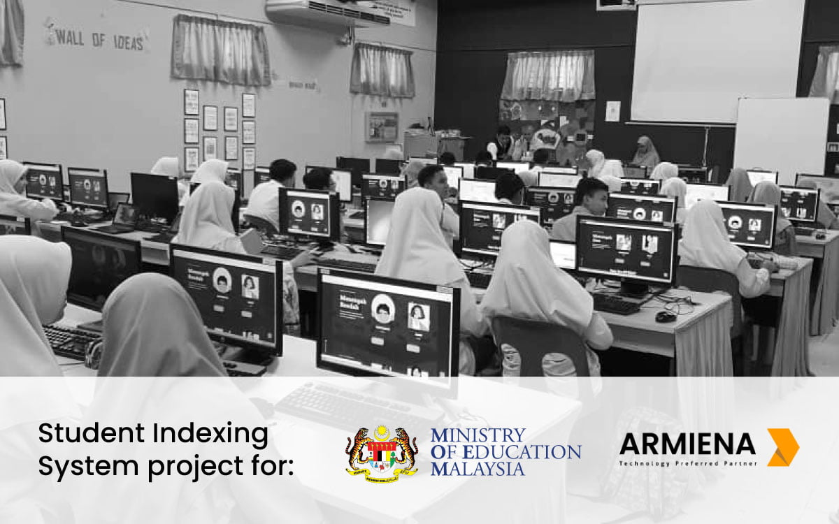
Ministry of Education Malaysia launched Science Technology Engineering Mathematics (STEM) education initiative in Malaysia Education Blueprint 2013 – 2025. Under Policy Planning and Research Division Education, the platform aims to collecting information for the Student STEM Index Instrument Development Study. This study aims to gain an insight into the culture of STEM education among students in Malaysia.
The Pusat STEM Negara provides great support on behalf of their student body. They needed a fresh portal that could showcase their range of services, engage multiple audiences, and create a significantly stronger user experience.
Project Objectives and Key Results
- Enhance overall aesthetic and user experience and to make the site more engaging
- Improve overall site architecture and navigation to enable easier browsing and a more frictionless experience
- Improve site conversion of users into app users
- Create a highly usable, search-able and browse-able Club catalogue for improved engagement
- Develop analysis and reporting system that support binary conversion from extracted data
- Implement a fully responsive solution backed by WordPress CMS
- Build out a robust survey functionality for school students with engaging graphics.
Prototyping : Start with the Facts
The Pusat STEM Negara provides great support on behalf of their student body. They needed a fresh portal that could showcase their range of services, engage multiple audiences, and create a significantly stronger user experience.
The focus for this project was a complete building site’s and database management system for Student STEM Index Instrument Development Study under Education Policy Planning and Research Division, Ministry of Education Malaysia. The structure and UI design include new photography, and refreshed contents and strategies. The goal was to strengthen the new site experience and consolidate their on-going development study of Student STEM Index.
Style Concepts : Make the Solution More Efficient
We had the opportunity to create a cleaner, and a more open look with modern typography and a big emphasis on imagery and visual storytelling. The use of vector and illustration throughout the site creates an immediate, authentic connection. The look is more polished, by making navigation and featured contents more enticing.
Conclusion : Bringing it all together
The new Student STEM Index website is much more aligned with their organizational goal in enhancing student experiences. Events, campaigns, and clubs are easily discovered and explored through the design. A clear, intuitive information architecture keeps their content accessible and reduces information overload. The site has seen great improvements on user engagement metrics, indicating that its student visitors are finding it more helpful and relevant.


